Web Design
HELPING YOUR BUSINESS GROW
Let our web design team create a website that works seamlessly with your sales funnel. If you don’t have a sales funnel, no problem… we can help with that too! Just click the marketing strategy link in the menu above.
Above The Fold
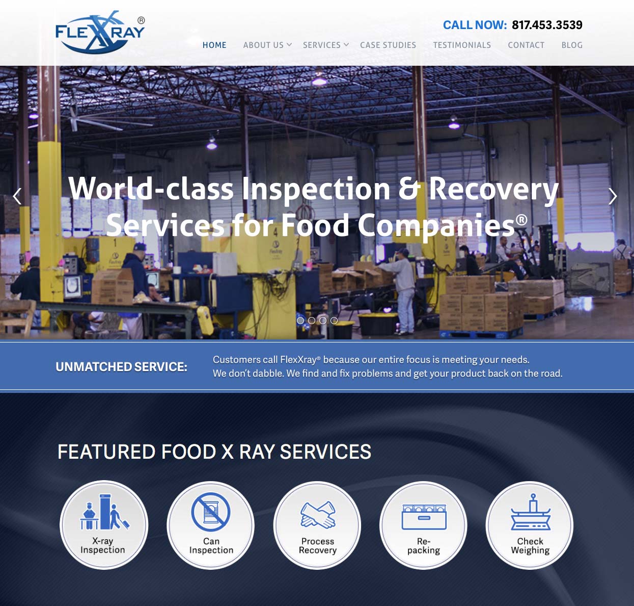
When people go to your website, the first thing they see are the images and text above the fold. The term “above the fold” comes from the newspaper industry and refers to the stories printed on the top fold of a newspaper. On a website, the images and the text above the fold are the things you see and read before you start scrolling down. Short, enticing, and extremely customer-centric…not information about how your company started.
Don’t Confuse Your Prospects
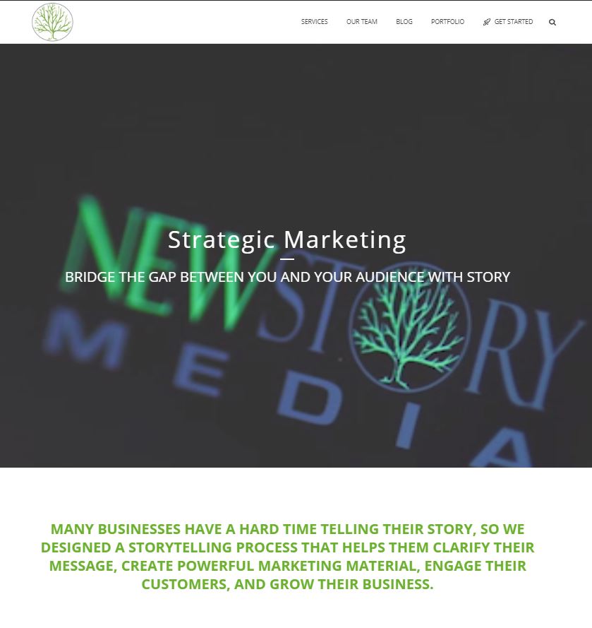
MANY BUSINESSES HAVE A HARD TIME TELLING THEIR STORY, SO WE DESIGNED A STORYTELLING PROCESS THAT HELPS THEM CLARIFY THEIR MESSAGE, CREATE POWERFUL MARKETING MATERIAL, ENGAGE THEIR CUSTOMERS, AND GROW THEIR BUSINESS.
How many times does this happen? You go to a website and there on the main page you find a long paragraph in teeny text about how the business got started and who the founders are… (yawn). You immediately check out mentally. They’re making you burn too many calories. One short sentence would have helped you understand what they offered, maybe even given you verbiage to help spread the word about their business. There’s no telling how many customers they’re losing because they’re making prospects work too hard to understand their service. Customers need to know what’s in it for them simply, quickly, and concisely. The text should be bold and the statement should be short. It should be easy to read and not buried under buttons and clutter.
Obvious Call To Action
The whole point of your website is to create a place where the direct call to action button makes sense and is enticing. While we’re in business to serve our customers and better the world, we’ll be out of business soon if people don’t click that “get started” or “buy now” button. For best results “Get Started” buttons should be a different color from any other on your site, (preferably brighter so it stands out), and all buttons should look exactly the same. There are two main places we want to place a direct call to action. The first is at the top right of your website and the second is in the center of the screen, above the fold. Your customer’s eyes move quickly in a Z pattern across your website. This means if the top left is your logo and perhaps a tagline, your top right is a “Get Started” button, and the middle of the page is followed by another “Get Started” button, then you’ve likely gotten through all the noise in your customer’s mind. They know what role you can play in their story.
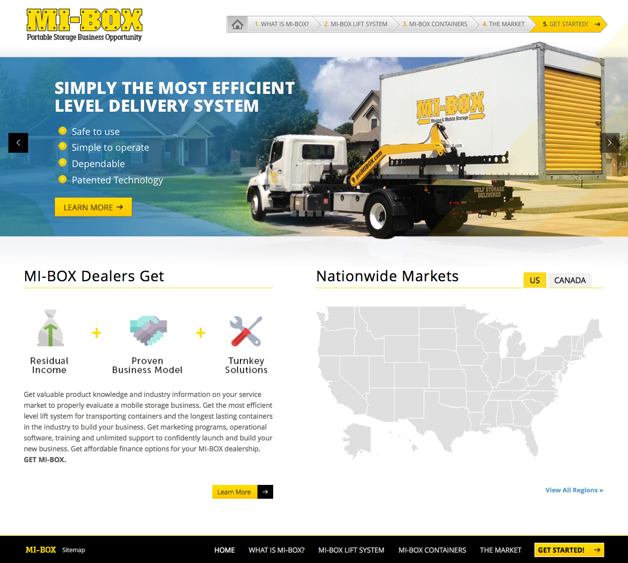
Image Of Success
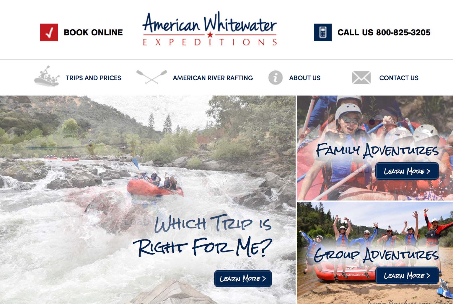
Images play a crucial role in the message we aim to portray on our website. It is imperative to understand that certain images resonate with a visitor more than others. For example, we wouldn’t want to lead with boring images of our building; this not only wastes mental bandwidth on meaningless messages, but it also enables our customer to become disinterested and mentally check out of the content they are looking over. We believe images of smiling, happy people who have had a pleasurable experience by engaging in your brand should be featured on your website. Images such as these speak to us and represent an emotional destination we would like to head towards. For those of you marketing a product, have a happy customer with a smiling face display it. Be careful not to lose authenticity and credibility by having everyone smile; make it seem genuine and real. Let your viewer be captivated by the true satisfaction that is found through your business.
Bite-Size Breakdown of Your Revenue Streams
Many businesses with a diversified revenue stream struggle to clearly communicate who they are and what exactly they do. Having this information simply stated on your website is essential to capturing and retaining business. If this sounds like a struggle you are trying to combat, start by coming up with an overall umbrella message that unifies your various streams. Once you can clearly articulate this message, you can separate the divisions using different web pages. When breaking down your divisions, make sure to continually emphasize clarity. A clear depiction of what you do helps customers choose their own adventure without getting lost.
Very Few Words
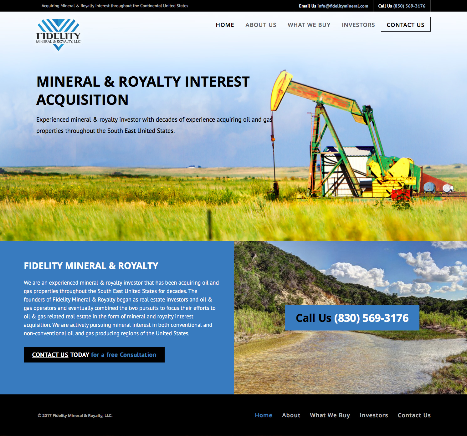
People seldom read websites, they skim them. We like the phrase “write it in Morse code”; this simply helps us remember to be brief, punchy, and relevant when conveying information to our customers. There are certainly many instances where important content needs to be explained with multiple sentences or even paragraphs. Invite viewers to access this information by providing a “Read More” button. This not only allows those that are intrigued to learn more, but also it mitigates the risk of deterring viewers who are not interested at all. It’s okay to include more words as you get further down your web page, but even then we wouldn’t recommend it. Some of the most effective websites we have seen have used ten sentences or less on the entire page! The fewer words used, the more likely people will read them.
